Spot the difference: Aldi changes logo
Rising supermarket giant Aldi is changing its logo as it seeks to freshen up its look.
The German brand will roll out new branding later this year, in the first change to its logo since the company launched its first stores in Australia 16 years ago.
The new logo retains a similar look to its current design, albeit with updated graphics.
Commercial Insights: Subscribe to receive the latest news and updates
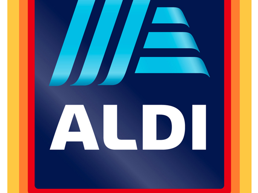
“Even the familiar ‘A’ symbol in light blue still forms part of the new logo, but now also functions as a modern independent design element,” an Aldi Australia spokesperson said in a statement.

Aldi’s logo has undergone many changes over the years.
“The original version of today’s logo was developed in 1982. This version included the cropped ‘A’ symbol on a blue background with a tricoloured border. In the years 2001 and 2006, several slight adjustments were also made to the logo’s colours.”
Aldi’s first logo was created in the 1940s, when its grocery stores were known as “Albrecht” – named after brothers Karl and Theo Albrecht, who owned them.
It began using a basic Aldi (an amalgamation of “Albrecht” and “discount”) logo in the mid-1970s.
The latest change is for all countries that come under the Aldi South Group, which includes Australia, the United States, the UK and Ireland.
It comes after Aldi last month revealed huge expansion plans for Australia, with a stream of new stores set to be opened across South Australia and Western Australia.
The German retailer plans to open 10 new outlets in South Australia this year, while Western Australia will receive 14 new stores.